Rethinking layout in Sketch with Stacks
Stacks are a new way to build flexible, adaptable layouts in Sketch. From buttons to complex UI, they’ll have a huge impact on how you work in Sketch. In this post, design lead Chris Downer shows us what they are — and why they matter.
In our Athens release, we’ve shipped a much-requested and long-awaited feature — Stack Layout (AKA Stacks). In short, with Stacks, you can create UI elements that shrink or grow in size, or adjust the size and spacing of their content depending on their context. You can also nest stacks within stacks to create really powerful and dynamic layouts. If you’re familiar with auto layout in Figma or stacks in Framer, this is our take on it.
In this walkthrough, I show you how Stacks work and how they can help you build layouts that adapt as you design.
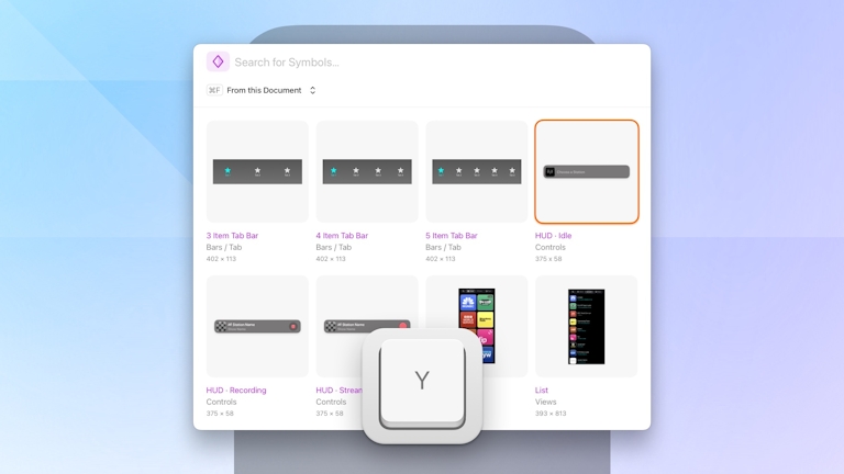
From Smart Layout to Stacks
There’s a lot to talk about with Stacks. Why now? How did we build them? What do they offer designers? I’ll try and answer the why and what questions in this post. We’ll save a longer, more detailed post on how we built them for some other time. For now, let’s start at the beginning and look at how Stacks came about.
Picture this: you’re adjusting the height of a UI element in your design, and then you need to manually select and move everything underneath it to correct the distance between layers. When you’re updating and iterating designs countless times, this work of dragging rectangles around is hugely tedious, and extremely inefficient.
Designers expect their tools to work with them, not against them, and this is exactly what we wanted to solve when we released Smart Layout in 2019. Our main focus then was simplicity. Layers in a group with Smart Layout would respect the exact positions you set, and only adapt if you resized, inserted or removed layers.
Smart Layout was received well at the time, but had its limitations. In wanting to make Smart Layout as simple as possible, we ultimately didn’t build it with the level of control people wanted and needed. This gave it a certain degree of unpredictability.
With stacks in Swift, flexbox in CSS, and similar approaches to these systems in other design tools, we naturally got more requests for better layout tools in Sketch. We had pushed Smart Layout as far as it could go, and it was time to build something new.
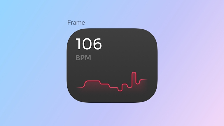
That something new became Stacks and, along with it, a new type of container in Sketch: Frames. This new container type was an essential step in building Stacks. Frames are neither a group or Artboard. They’re far more flexible and, crucially, can have either a fixed size, or be dynamic and fit their contents. We’ve got another blog post on Frames that’s worth reading.
Designing with Stacks
So, how do you use Stacks, and what are the best practices?
First of all, there is no right or wrong way to design with stacks. You might create a stack before you add any content, or you might create a stack around something you’ve already designed. With the latter, when you add a stack to an existing design, we apply the most relevant stack layout properties you might need, based on how your layers are arranged on the canvas.
The most basic example of stacks is a button that shrinks or grows based on its content. Just draw a rectangle, and add a text layer on top of it. Select both layers and press ⌘L. That’s it! As I mentioned above, we apply the most logical layout settings automatically. You’ll also notice that the rectangle you drew has disappeared and its style properties are now part of the stack itself.
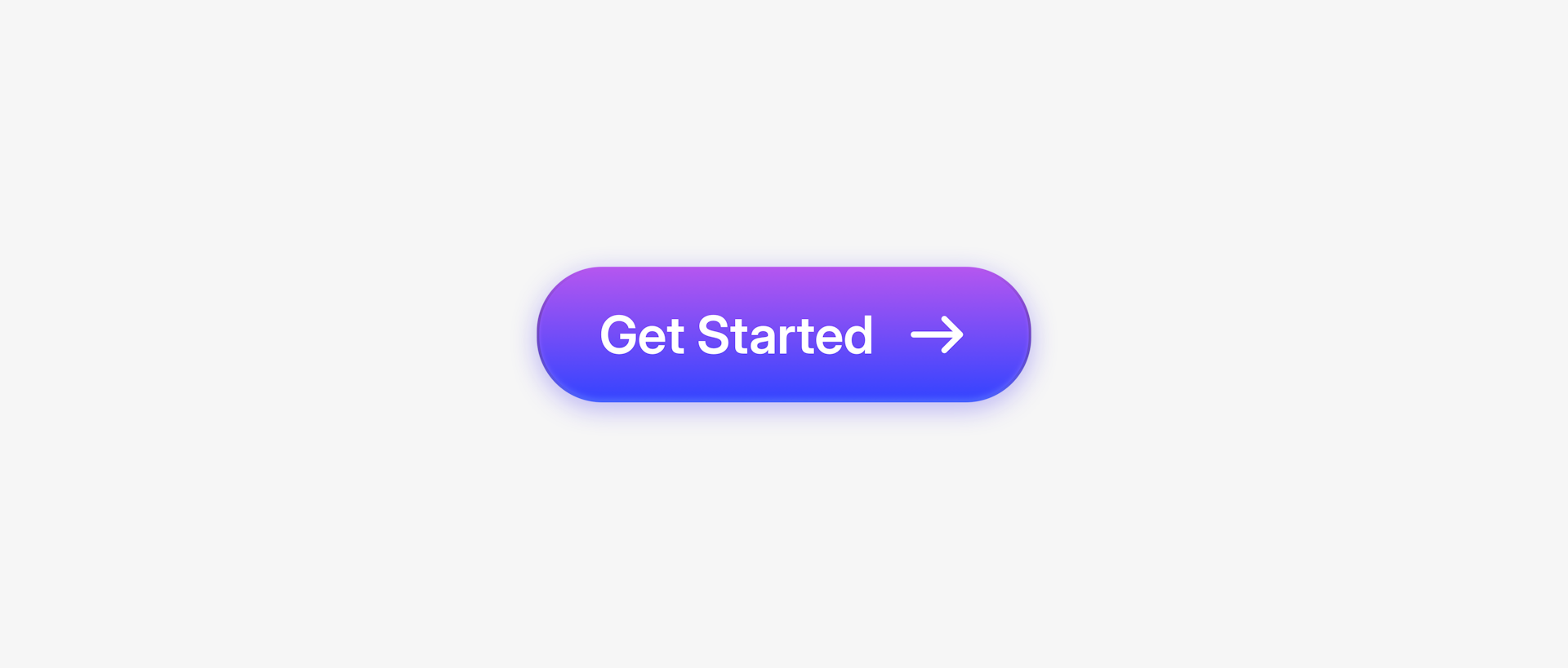
This button is built with a horizontal stack — spacing and alignment included.
Once you’ve made your button, you can adjust things like padding and alignment in the Inspector, or click and drag to set padding visually on the Canvas. If you drag and drop an icon into your button, it’ll become part of the stack. Everything will adjust dynamically because the stack’s width has been set to fit to the size of its contents (the total of the layer + gap values + padding).
With Stacks, your button adapts as you build it. No manual nudging required.
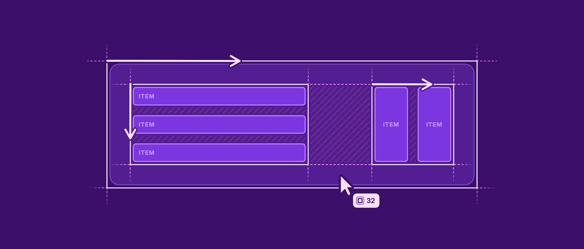
Items inside a stack flow in either a horizontal or vertical direction. You cannot freely position layers in stacks like you can anywhere else in Sketch, at least not by default. Naturally, you can’t have both horizontal and vertical layouts in the same stack, but you can nest a vertical stack within a horizontal one (or vice versa).
In this more complex example, we have a modal dialog which uses a combination of horizontal and vertical stacks, nested into a vertical stack whose height will change depending on the text length.
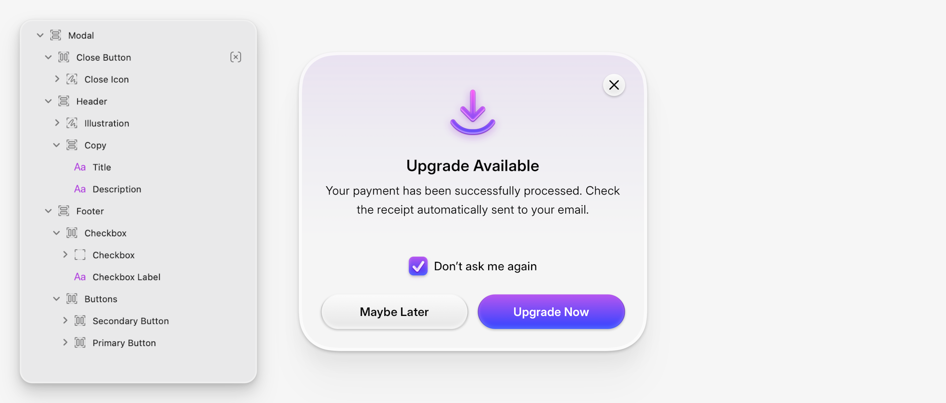
Each section — from buttons to checkboxes — is organized with its own stack.
Inside this stack we have the title and description inside a vertical stack. The checkbox and label are in a horizontal stack. There’s another horizontal stack containing the two buttons (that are horizontal stacks themselves!), all contained in a vertical stack, aligned to the center, with a consistent padding applied around the contents.
If you’re wondering about that close button, it’s also inside the stack, but with the Ignore stack layout property enabled (you’ll find it in the Inspector). This allows us to place it freely in the top-right corner without affecting other layers. This, along with the option to override alignment on a per-layer basis (select a layer, then click on the alignment controls at the top of the Inspector), gives you a useful safety net when you need to make exceptions within a stack.
A better way to design
I don’t think it’s hyperbole to suggest that using stacks will make you a better designer. If you’re unfamiliar with them, it can take a little while to understand — that’s okay. But there is a point where it will just click and it completely shapes how you think about your designs.
Stacks change how you think about layout, forcing you to be intentional with spacing and alignment.
Stacks force you to be intentional with spacing and alignment, and reduce the number of inconsistencies that can happen when designing freeform. They also save you time so you can iterate faster, explore alternate layouts and future-proof your design if it needs to be updated.
On top of this, they’ll change the way you think about layout, bringing things closer to how designs are actually implemented and improving handoff with developers. Speaking of which, we’ve of course reflected stacks within our own handoff tools in the web app.
I hope this brief overview shows off the power and possibilities of Stacks, which are available today in the latest version of Sketch. Please check out the documentation for a detailed overview of stacks with explanations of all the new settings.
As always, we’d love to hear your feedback over on our community forum. I can already share with you that we’re planning on improving Stacks further by adding more options — including the ability to wrap contents. Stay tuned!