A new chapter for the Command Bar
Insert and replace Components, browse better previews, move through Libraries faster — and much more. Learn how it all came together and how to make the most of the Command Bar.
In our Athens release, we’ve built upon what we introduced in version 100 with the Command Bar, and added the option to insert and replace Components straight from the Command Bar. And for when you’d prefer something smaller and contextual, we took the best of the Command Bar and rethought it for a new popover made for the Inspector. And of course, we packed plenty more: better previews, a quicker way to navigate Libraries and groups, and more.
Let’s take a look at what’s new, how it improves upon the previous workflows, and how it all came to be.
Building on a tested foundation
In version 100, we introduced the Command Bar: a fast, keyboard-first way to surface all the things you can do in Sketch. We audited over 300 existing actions to add icons, colour-coding, and other things needed to make them shine in the Command Bar. We wrote a custom search algorithm so you only need to type parts of an action’s name, an abbreviation, or even just part of its menu path to find it. We also made it learn — entirely locally — from your habits to put the actions you use the most right at the top.
However, we always knew it was just its first chapter. We’d long felt we wanted an interface for inserting Components that made navigating libraries quicker and easier, gave us much more useful previews, and would also work for replacing Components.
Bringing Components to the Command Bar
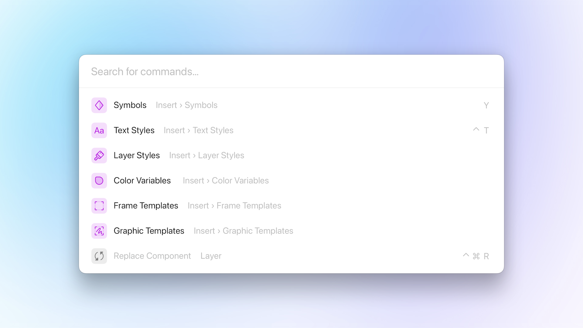
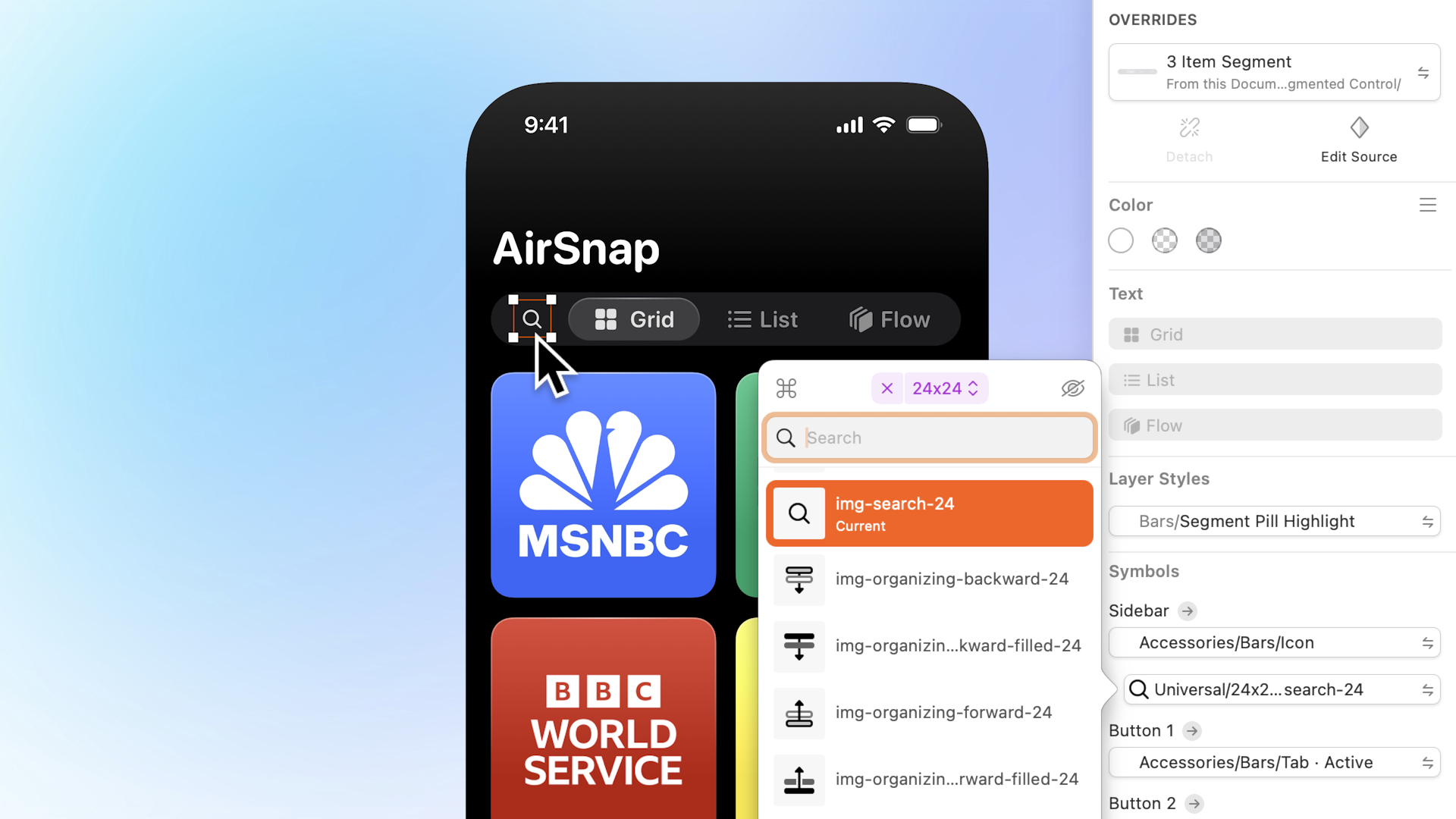
When you open the Command Bar in Athens you’ll no longer see just an empty search field.
You can now insert and replace every kind of Component from the Command Bar. Taking over from the old Insert Window, and the menus in the toolbar and Inspector, the Command Bar has a new springboard with actions for picking Components. You can also search for these actions, or use the items in the menu bar.
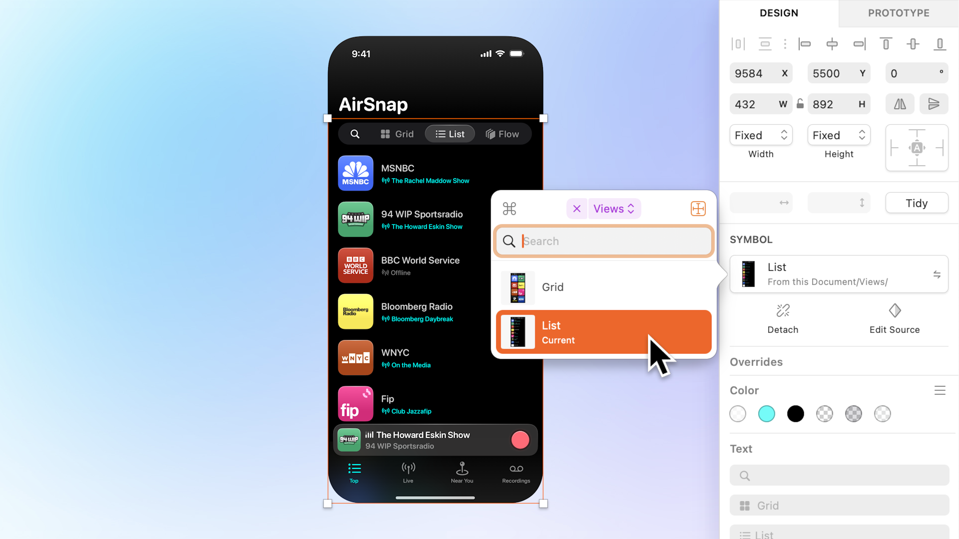
Each of these actions take you into what we call a Command Bar mode. Up until now, the Command Bar had only one mode: actions mode (which is still the default). But now, it has a new one for each Component. I’ll get to the details of each in a moment, but essentially, each one gives you a dedicated interface designed for picking a specific kind of Component. To show you what I mean, let’s take a look at the new Symbols mode.
You can always tell you’re in a Component mode by the purple token.
Looks pretty different to actions, huh? There’s a lot to look at here, so let’s go on a little trek amongst this new interface, and see what’s what. You can always tell when you’re in a different mode by the little purple token to the left of the search field. To exit a mode you can click it, or press the ⌫ key twice with an empty search field.
A quicker path to finding Libraries and groups
While each Component mode has an interface dedicated to their Component type, they all share one other important similarity: the path bar at the top. One of the biggest challenges we faced with bringing Components to the Command Bar was navigating Libraries and groups. We had a lot less space to work with, and we wanted to make something that was quicker and less frustrating than the old Insert Window, and Insert menus.
We really didn’t scrimp on keyboard shortcuts.
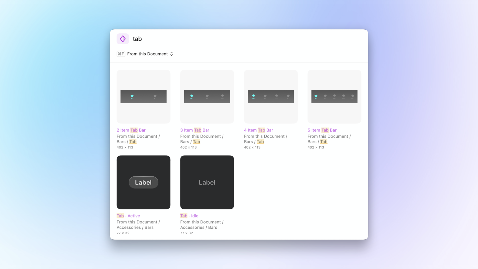
The first item in the path bar tells you which Library you’re in (or if you’re looking at everything). You can click it to pick a different Library, or press ⌘F. With your hands still on the keyboard use the arrow keys to navigate to a different Library, or to a group therein, then press ⏎. To go back to viewing everything in the Library press ⌥⌘▲, or press ⌘▲ to navigate to the parent of the group you’re in. To navigate to a sibling or subgroup of the current group press ⌘▼ — this will open the menu for the last item in the path bar, and you can use the arrow keys to pick a new group.
To insert any Component, use the arrow keys to select it, and then press ⏎. While we’re talking selection: even if you have a Component selected, like with actions, you can just start typing to refine your search. If you press ▲ while at the top you can also select everything in the search field to start a new query.
The Command Bar is smart about remembering where you left off. So even as you’re flying around the canvas, opening and closing the Command Bar, it’ll remember which group you were in, and which Component you had selected. This makes inserting the same Component, or multiple Components from the same group really easy.
We know that’s a lot of shortcuts to get your head around, but once they become second nature we hope you’ll agree that it makes using the new Component modes very snappy. However, if you prefer to use the mouse, you can click any of the path items to open their menu of sibling (and therefore also sub-) groups, or ⌘-click an item to jump right to that group. You can also double-click a Component, or drag it out straight onto the canvas.
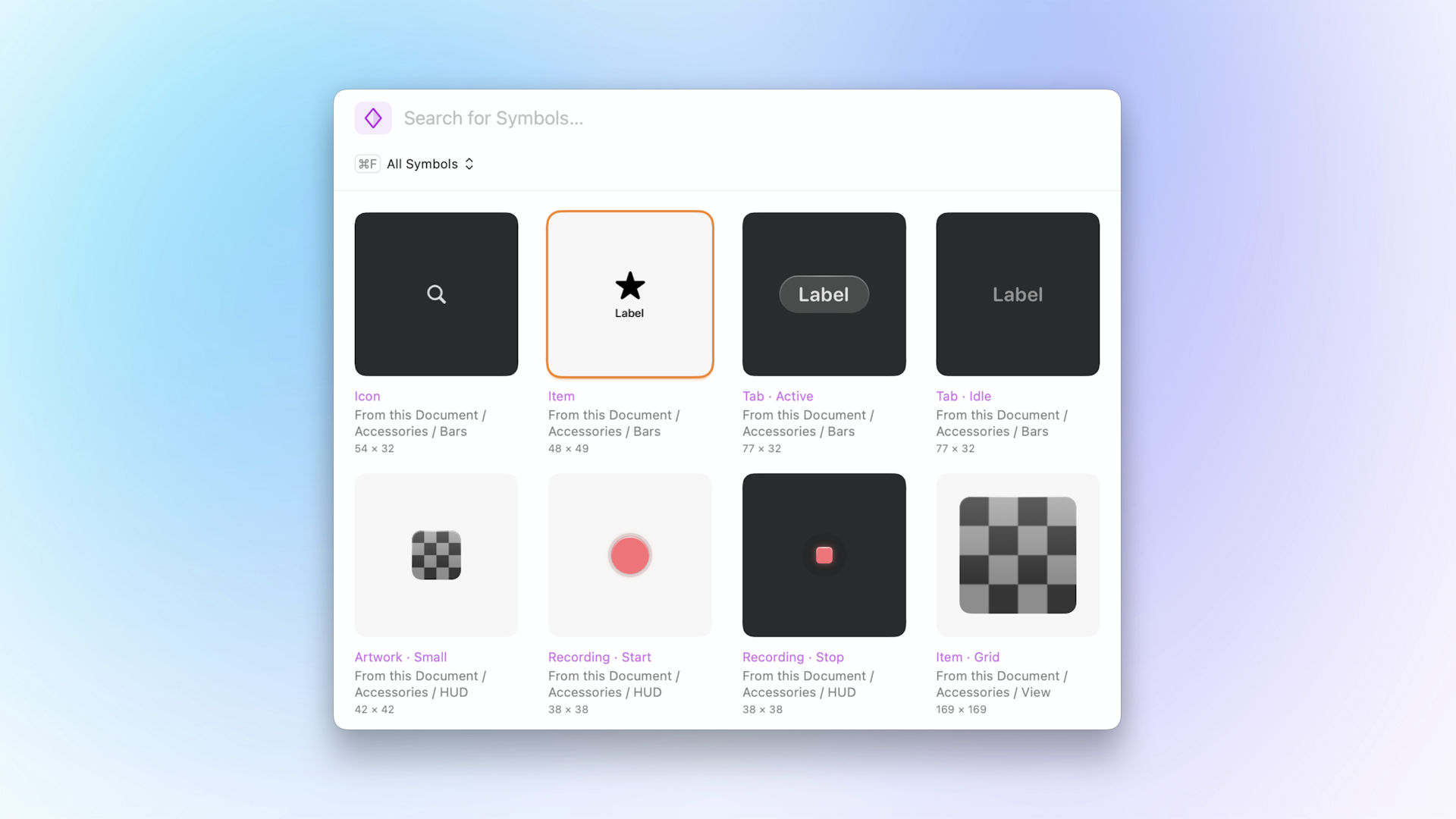
Proper previews
In many cases the Component previews in the old Insert Window, and especially in the Inspector menus weren’t the most helpful. They were either too small, wasted too much space, or didn’t show enough metadata. With the Command Bar we rethought each Component preview to show as much information as possible, and give you the best idea of what a Component will look like before you pick it.
On the surface it might look similar to the old one in Insert Window, however, the new Symbols grid has a bunch of improvements.
The Symbols grid is more space efficient allowing you to see an extra column of Symbols compared to the same space in the Insert Window. In fact we liked it so much we’re also using it for Frame Templates, and Graphic Templates.
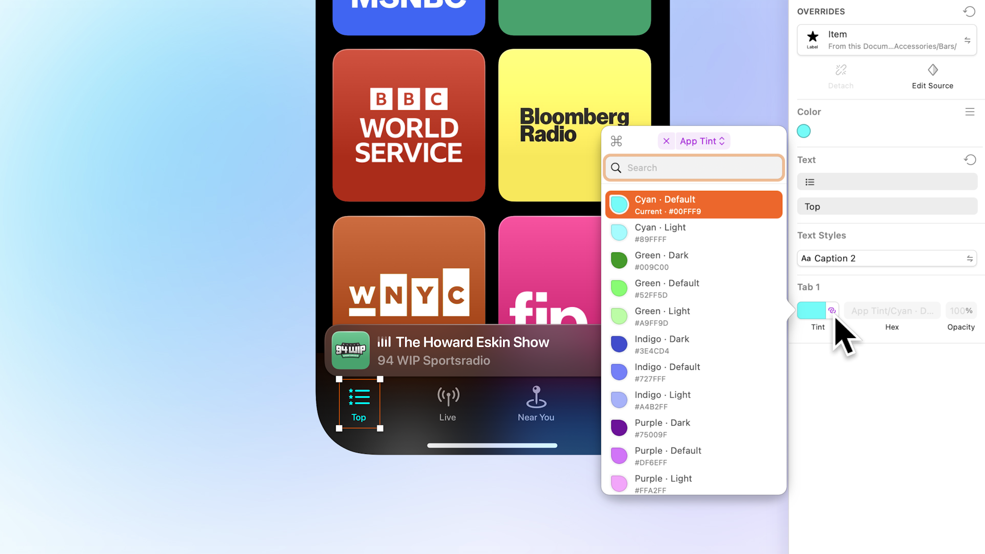
Light, dark, or automatic. Now you get to choose! Existing and new Symbols are set to automatic by default.
You can also now set light or dark backgrounds for Symbol previews. This one in particular was bothering us for a while, and probably you, too. If you had a Symbol that was predominantly light with a transparent background you’d get a preview with a light background that made the Symbol impossible to see (and vice versa in dark mode). In Components mode you can now choose whether a Symbol has a light background, a dark background, or sticks with the app’s appearance.
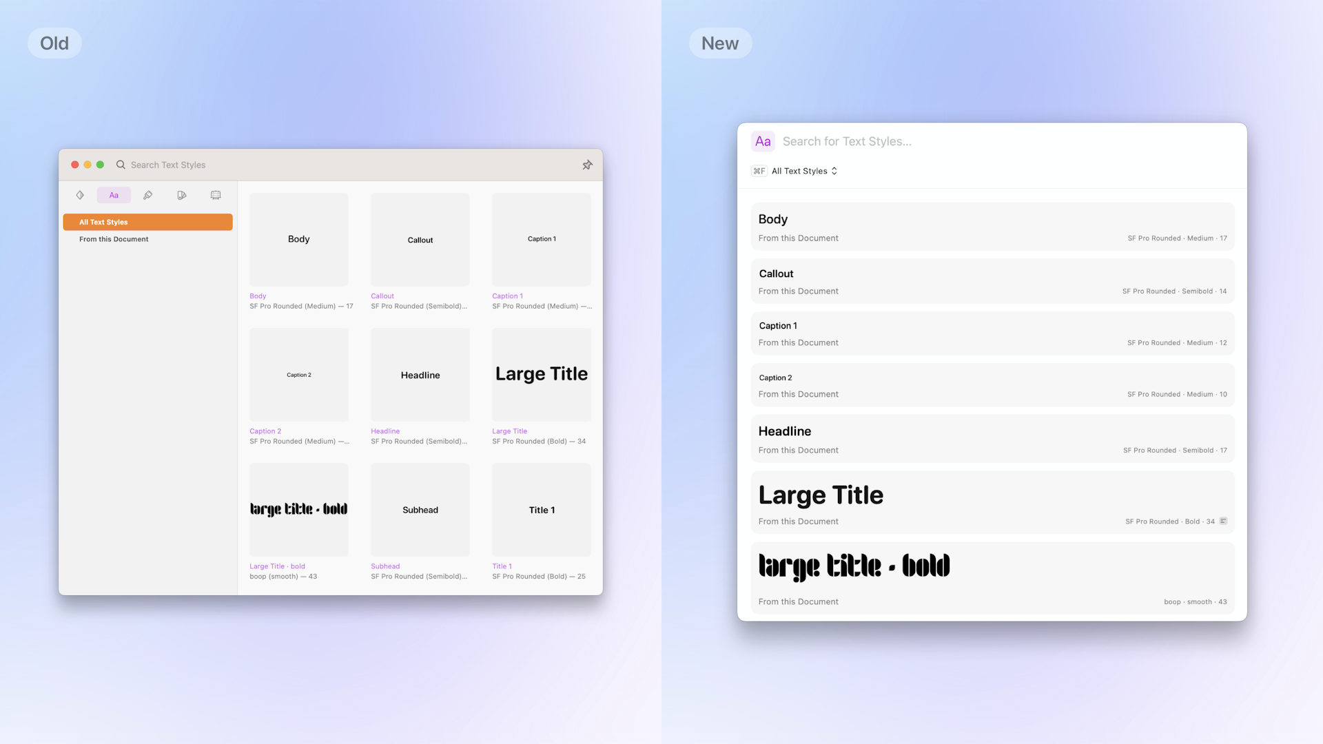
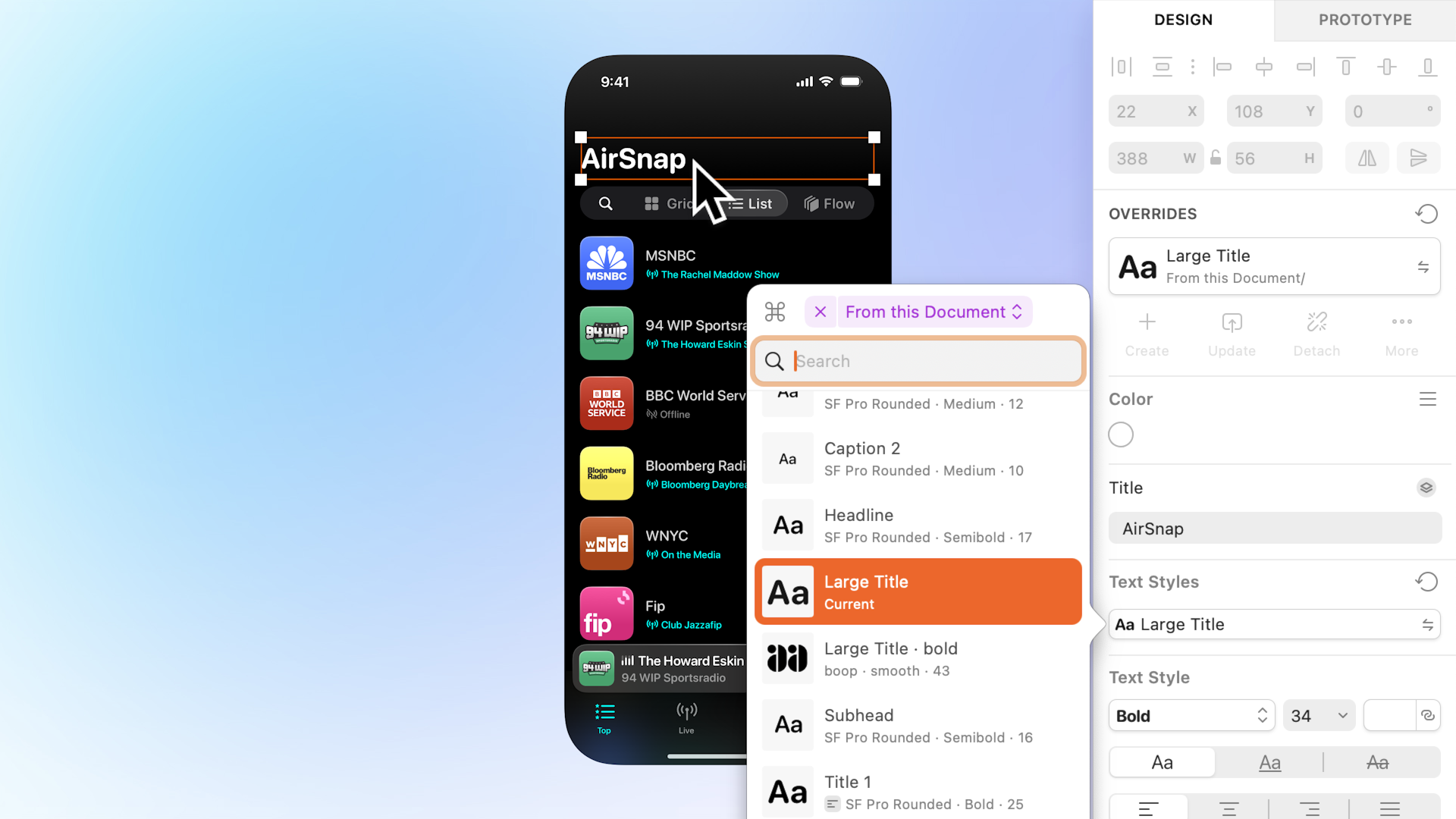
With more space, previews for Text Styles are now more realistic, and are able to show more metadata.
We redesigned Text Style previews to provide more room for preview text using the style’s font size (up to a sensible limit). This makes them a much more accurate representation of how text with that style will look. We also include more metadata, and give it more room so it’s less likely to get truncated. Each preview is aligned for easy scanning, and we indicate alignment (if included in the style) with the other metadata.
For Text Styles we wanted to take the small, hard-to-read previews of the Insert Window, and replace them with bigger previews built specifically for them. For Layer Styles, and Color Variables we had almost the opposite problem to solve.
Layer Styles, and Color Variables share a similar, dense, two-column grid that makes much better use of the available space compared to the Insert Window. Where previously you’d see six Color Variables in the Insert Window you can now see ten in the Command Bar, and for Layer Styles you can now see twelve.
Replacing Components using the Command Bar
Of all the workflows we examined in this project, this is the one we’ve improved the most, and the one we’re most excited about.
To replace Components before Athens, you could only use the Inspector menus where you’d have to dig through submenus, and risk losing your place with one wrong move. We’d been wanting to replace (pun intended) this interface for a while now, and with the Command Bar we think we’ve built something much better.
You could say we did everything to get inserting Components in the Command Bar working just so we’d have an excuse to then do replacing.
To replace a Component you only need to remember a single shortcut ⌥⌘R or search for the “Replace Component” action. Both open the Command Bar, and take you straight to the Library or group the current Component belongs to, ready for you to pick a replacement.
By organising your Components into groups — like icons of a certain size — you can have related ones appear when you want to swap one for another. We’ve found this to be particularly helpful for replacing nested Symbols like an icon, or for swapping one button variant for another.
When replacing Symbols, there are a couple of extra controls at the end of the path bar:
- For top-level Symbols, you’ll see a button that lets you choose whether or not the replacement should use the size of the current Symbol, or use its own size. If you were used to the “Swap at Original Size” option in the old Inspector menus, this is that, but with a clearer name: “Preserve current dimensions”.
- For nested Symbols, you’ll instead see a toggle that lets you hide the nested Symbol rather than replace it. Likewise, if you were fond of using the “Hide Layer” option in the Inspector menus this is its replacement.
Replacing Components in the Inspector
I’ll let you into a little secret: our first crack at updating the Inspector used the Command Bar for picking Components. However, once we used it, and as we heard from folks using the beta, we realised this wasn’t ideal. When using the Inspector we wanted something that kept us in our current context even if that meant smaller previews.
When using the Inspector we wanted something that kept us in our current context even if that meant smaller previews.
This led us to rethink (again) how we replace Components in the Inspector. What we created was a brand new popover that takes the best of the Command Bar modes, and shrinks them down into an interface designed for the Inspector — the best of both worlds.
Familiar, but different

You can now search inside a specific group when replacing a nested Symbol.
To open the new popover just click any of the usual Inspector buttons. With less space to work with we couldn’t just take the same elements from the Command Bar, and squish them. The path bar, for example, just wouldn’t work. So instead we made a nifty popup button that serves a similar role.
The Library picker lets you quickly jump to a different group, or check which Library you’re in.
You can navigate to a different Library or group by clicking the Library picker button at the top of the popover. Other Libraries are always at the bottom, and towards the top you’ll find the parent groups (and Library) of whichever group you have selected. You can clear any group or Library filter by clicking the ×, or by pressing ⌃⌥⌘▲. Like the Command Bar, the popover automatically opens in the current Component’s group — so if the replacement you want is in that group you don’t need to go anywhere else.
When you find the replacement you want just click it once; or use the arrow keys to select it, and press ⏎. One thing you won’t find in the popover are any animations. We wanted everything about it to feel fast, and once you try it we think you’ll agree: replacing Components this way just feels zippy.
Honey, I shrunk the previews
Itty bitty Symbol previews still let you double check you’re picking the correct replacement.
Unlike the Command Bar, every Component is displayed as a list to save space. However, that doesn’t mean we scrimped on previews or metadata.
Symbols, Layer Styles, Frame Templates, and Graphic Templates now have larger, easier to see previews. Perhaps the biggest improvement is that Symbols will also use the background you’ve set for them — no more white Symbols on fuzzy, light menu backgrounds.
When you’re replacing Symbols, the button to the right of the Library picker changes depending on context just like the Command Bar. For top-level Symbols it’ll be the preserve current dimensions toggle, and for nested Symbols it’ll be a toggle to hide or show it.
Color Variables get the new preview style from the Command Bar, and the same hex and opacity metadata, too.
Text Style previews were by far the most difficult to shrink down for the popover. We explored several designs — including using the full width for the text preview — but we found they made scanning the list too difficult. We landed on a balance where the previews still give you a sense of the style, while also leaving room for all the same metadata as the Command Bar.
Bigger previews are always just a click away
The popover previews pack in a lot of detail, but they’re small by design. If you need bigger previews you can always click the button to the left of the Library picker, or press ⌥⌘R. This’ll take you to the same place in the Command Bar, and keep your search term. You can also jump straight to the Command Bar by ⌥-clicking the Inspector button. If you’d rather not hold ⌥ every time, we have a new preference to control exactly that: “Use the Command Bar for Replacing Components”. Holding ⌥ will always do the opposite of how you set this preference.
The next chapter for the Command Bar
As you can see, the Command Bar isn’t standing still. Our goal is to improve how you use Sketch every day, and adding Components to it brings us one step closer to that.
This is just the second chapter for the Command Bar. If you’ve already tried Athens you might’ve noticed that our logo is now in the toolbar, and clicking it opens up the Command Bar. There’s a good reason for that, but that’s a story for another time. 🤫
Thanks for reading all this way. If you have any questions or feedback — or just want to share how you’re getting on with Athens — we’d love to hear from you in the forum. And a big thank you to everyone who tried the beta and shared their thoughts. We can’t wait to see what you make with Athens.